
The purpose
In HTML, the -webkit-text-stroke style is available for outlining text. (Although it has -webkit- prefix, it reportedly works in Firefox and Safari as well. I have confirmed its operation in Firefox.)

However, when I actually tried using it, its behavior was questionable, so I will show a confirmation of its actual movement and introduce alternative methods.
Simple Usage
The basic usage is as follows:
-webkit-text-stroke: Width Color;Example:
-webkit-text-stroke: 1px red;Behavior Confirmation
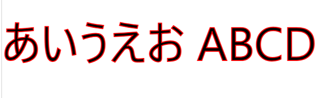
Let’s see the behavior of the following HTML.
<p style="font-family: system-ui;font-size: 96px;-webkit-text-stroke: 2px red;"
>あいうえお ABCD</p>
Chrome(135.0.7049.115):
FireFox(138.0):

With the settings above, it seems to be displayed correctly in Chrome/Firefox.
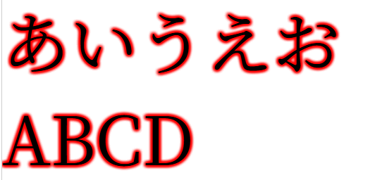
Next, we will look at the behavior of the following HTML. (The font has been changed from system-ui to serif.)
<p style="font-family: serif;font-size: 96px;-webkit-text-stroke: 2px red;"
>あいうえお ABCD</p>
Chrome(135.0.7049.115):

FireFox(138.0):

With this setting, it displays correctly in Firefox, but in Chrome, the border also intersects at overlapping points. I believe this is an undesirable result for many people, including myself.
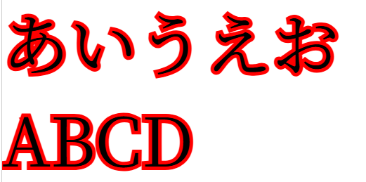
Next, we will look at the behavior of the following HTML. (The stroke width has been changed from 2 to 10.)
<p style="font-family: system-ui;font-size: 96px;-webkit-text-stroke: 10px red;"
>あいうえお ABCD</p>
Chrome(135.0.7049.115):

FireFox(138.0):

With this setting, neither Chrome nor Firefox display the black text; instead, it appears to be filled with the stroke color. (While this might have its uses in some scenarios,) I believe this is an undesirable result for many people, including myself.
Workarounds
As seen above, -webkit-text-stroke often doesn’t behave as expected.
Here, I will demonstrate other methods to display a border around text.
Use TextShadow (repeat)
We will try the following code.
By repeatedly displaying a blurred text-shadow in the same location, it appears as a border.
(If you reduce the number of text-shadows, the border will become blurred.)
<p style="font-family: serif;font-size: 96px;text-shadow: 0px 0px 5px red,0px 0px 5px red,0px 0px 5px red,0px 0px 5px red,0px 0px 5px red,0px 0px 5px red,0px 0px 5px red,0px 0px 5px red,0px 0px 5px red;"
>あいうえお ABCD</p>
Chrome(135.0.7049.115):
FireFox(138.0):

With this setting, both Chrome and Firefox were able to display it as intended.
USe TextShadow (around)
We will try the following code.
By repeatedly displaying an unblurred text-shadow with slight offsets, it appears as a border.
<p style="font-family: serif;font-size: 96px;text-shadow: 0px 0px red,1px 0px red,0px 1px red;1px 1px red"
>あいうえお ABCD</p>
Chrome(135.0.7049.115):

FireFox(138.0):

I was able to get it working for the time being.
However, as mentioned above, if the text is large, the border is barely visible.
(If more text-shadows were rendered with offsets, it would probably look more like a border, but I don’t think it’s practical without writing a script.)
When the text is small, it displays as shown below, and there is no problem.

-webkit-text-stroke and Fixed Display Position
We will try the following code.
It draws a string where the text body and border are filled using -webkit-text-stroke, and then draws the text body and border by writing the same string at the same position.
<div style="position:relative;font-size: 96px;font-family: serif;">
  <div style="-webkit-text-stroke: 10px red">あいうえお ABCD</div>
    <div style="position:absolute;top:0px">あいうえお ABCD</div>
  <div>
Chrome(135.0.7049.115):
FireFox(138.0):

With this setting, both Chrome and Firefox were able to display it as intended.
Result
I have confirmed the behavior of -webkit-text-stroke.
Furthermore, regarding the settings that did not behave as expected with -webkit-text-stroke, I was able to display them with the intended style using alternative methods.

コメント